case-study-oneeleven
case study · OneEleven
From coaching tool to daily
Opening up OneEleven’s Spending Plan — a coach-only budgeting tool — into a member-facing web product that answers “Can I afford this?” in a few seconds.
ROLE
Product engineer, end-to-end
PLATFORM
Web member portal
type
Product exploration
Overview
OneEleven’s Spending Plan is one of the platform’s most valuable coaching tools — but members cannot touch it. Coaches worked from a robust web application during sessions, while members left with no way to monitor progress or adjust their plan on their own. Everything they learned lived in a one-hour conversation, then went quiet until their next appointment.
I explored how the Spending Plan could evolve into a connected member product — one that empowers informed financial decisions between coaching sessions. Rather than starting from screens, I started from a more fundamental question:
how might we
…help members answer "Can I afford this?" in just a few seconds?
The result: a product exploration centered on lightweight decision support, positive financial behaviors, and a phased rollout that balanced user needs with engineering constraints.
interaction pattern research
How do financial products help people decide?
Before exploring solutions, I studied how modern financial products help people make decisions—not display static data. Across the products I reviewed, three interaction goals kept recurring:
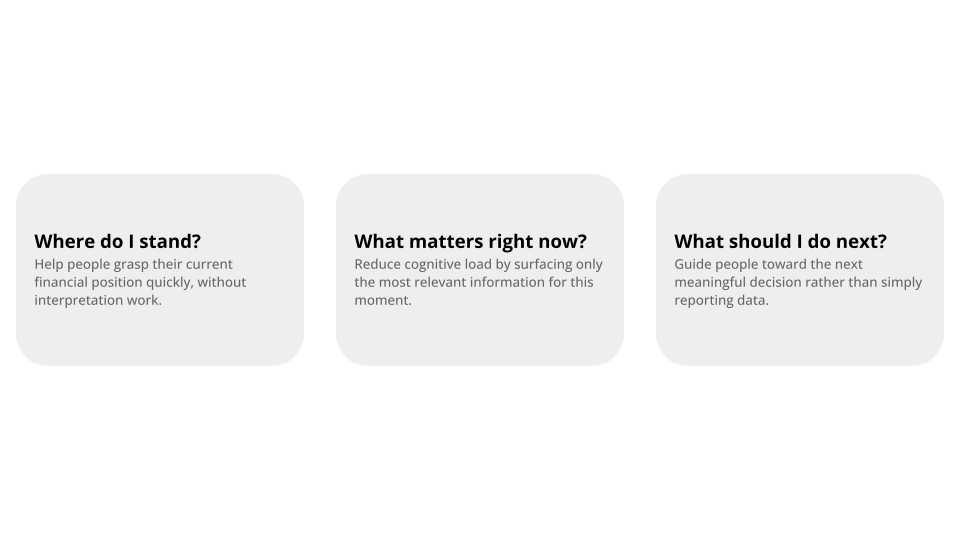
Design Principles
The research pointed to recurring patterns that make financial information easier to understand and act on. I committed to four, ordered the way a member should experience them:
At-a-glance awareness
The answer to “where do I stand?” is visible in the first second, with zero interaction.Progressive Disclosure
Summary first; buckets, categories, and line items reveal only as the member asks for them.Support at the transaction
Meet the “can I afford this?” moment where it happens — a purchase decision, not a monthly review.Details on demand
Full fidelity — every category and dollar — stays one click away, never in the way.
Design Exploration
Three concepts, three answers to the question
Each concept led with a different piece of information and a different primary action. Testing them against the HMW — seconds to an answer — is what ultimately shaped the final direction.
Concept A — Dashboard-first
“Give members the same picture their coach sees.”
Why you explored each.
What worked.
What didn't.
Why you moved on.
Concept B — Goal-first
“Lead with what the money is for.”
Why you explored each.
What worked.
What didn't.
Why you moved on.
Concept C — Decision-first
“Answer the actual question.”
Why you explored each.
What worked.
What didn't.
Why you moved on.
where i landed
Decision-first, built in phases
Decision-first was the clear winner against the HMW — the only concept that answers in seconds. But it can’t ship first: the trust and data it depends on come from the awareness layer of Concept A and the motivational context of Concept B. So the rollout builds toward it.
reflection
What this project taught me
Design for seconds, not sessions.
Concepts can be layers, not contestants.
Constraints shaped the sequence, not the vision.
Ultimately, the coach is the differentiator.
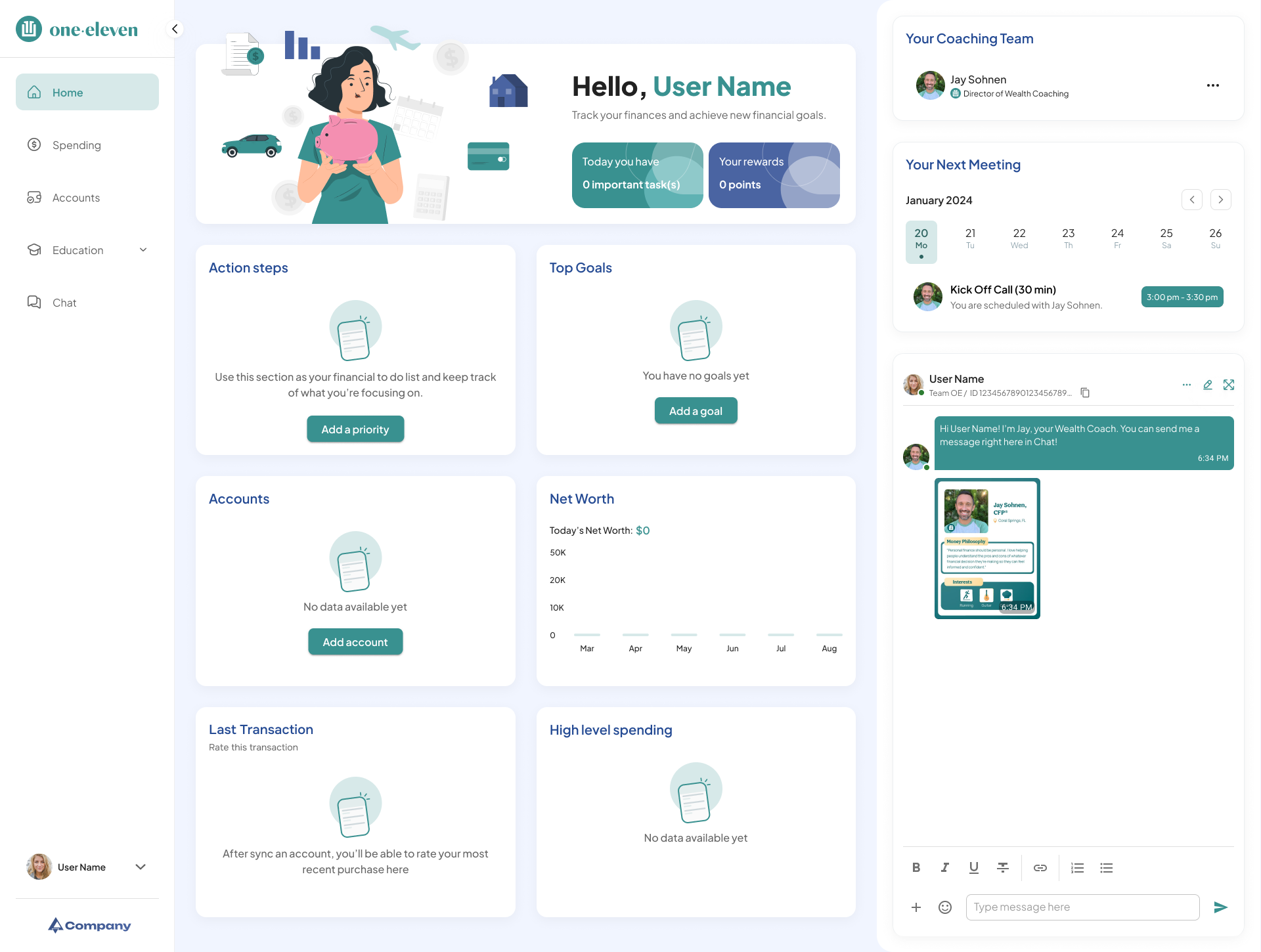
Member Dashboard Experience
this is a placeholder for the